Mobile
Below 768 px the workspace switches to a phone layout. This page documents what actually changes, with the measurements the project recorded while building it.
Breakpoints
There is no custom media abstraction and no Tailwind in the application. The breakpoints are
plain @media (max-width: N) literals, inherited rather than invented:
| px | What changes |
|---|---|
| 1439 | Topbar becomes a two-row grid; the optimizer’s trial inspector becomes a fixed right drawer |
| 1023 | Optimizer columns collapse to one; the analysis section sidebar becomes a drawer |
| 900 | Pareto panel and results shell go single-column |
| 767 | The phone boundary — everything below applies |
| 700 | Navigation and account density; brand and the create-account link are hidden |
| 600 | Headline grids halve; eyebrow labels and status pills hide |
| 390 | Custom-timeframe field and account menu narrow further |
| 359 | Ultra-narrow navigation trims; the theme toggle shrinks |
How the phone layer is kept out of the desktop layout
Phone-only elements are given display: none at the top level of the
stylesheet, outside any media query.
That is deliberate rather than tidiness. The pane switcher is a child of
#workspace, which on desktop is a three-column grid — so an unhidden extra child
would occupy column one and shove everything sideways. Declaring it hidden once at the top
level means the desktop grid never sees it, with no media query and no specificity fight.
The only rules above 768 px are safe-area padding, which is 0 without a
notch.
The pane switcher
On a phone the chart and the sidebar cannot sit side by side, so the workspace becomes a
two-tab switcher with a role="tablist".
| Tab | Shows |
|---|---|
| Chart | The chart pane |
| Pine Script | The sidebar, editor tab |
| Trades | The sidebar, trades tab |
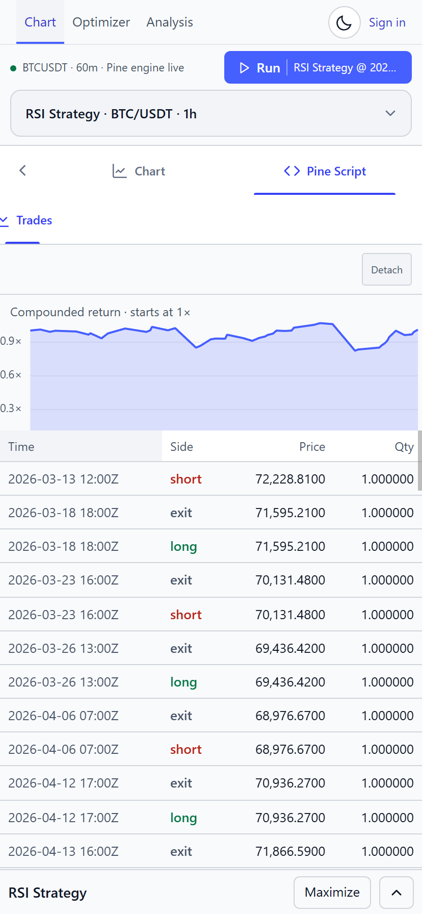
The existing chart and sidebar elements are reused, so the Monaco and Vela instances are the same ones — nothing is torn down and rebuilt when you switch panes.
Pane choice persists in localStorage under trad:mobile-pane:v1.
The bug that produced three rows of tabs
The first version rendered the same two destinations twice — once in the switcher and again in the sidebar’s own tab row directly beneath it, with a Chart tab restating what you were already looking at.
The first fix attempt wrapped rather than hid. The bar was a three-column grid with a
:has() rule rewriting its tracks when the chevron appeared. It still wrapped,
because #chart-pane-switch button setting display: flex outranks the user-agent
sheet that gives [hidden] its display: none — so the “hidden”
Chart tab kept painting and kept its grid track. Four live items into three tracks.
The real fix was structural rather than clever: the bar became display: flex,
the chevron a fixed 44 px, the tabs flex: 1 1 0, and a
button[hidden] rule set to display: none restored hidden’s
authority. No :has(), no track arithmetic.
Measured after the fix — a single row in every state at 414, 360, 359 and 1600 px.
Results first
On a phone the backtest panel stops being a strip at the bottom and becomes the main event.
| Desktop | Phone | |
|---|---|---|
| Panel height | 320 px | 62 vh |
| KPI headline | Above the charts already | Moved deliberately ahead of the charts |
| Optimizer heading | Visible | Description hidden |
| Filter band | Wrapped grid | One horizontal scroll strip |
| Compute hint | Hidden | Shown only inside the optimizer |
Why the headline had to be reordered — and why flex, not grid
Reordering the headline with grid order put it in a row the grid sized to its
own padding, so the KPI values drew over the equity curve.
The fix was to make the panel body a flex column rather than a grid. The underlying reason
is recorded in the stylesheet: the panel body is a grid whose items sit behind two
display: contents ancestors, and letting the grid size that row collapsed it.
Flex sizing stops the row collapsing.
Sheets and menus
Several desktop affordances become sheets or menus rather than shrinking.
| Control | Desktop | Phone |
|---|---|---|
All <select> elements | Anchored dropdown | Bottom sheet |
| Market / instrument controls | Four groups in the topbar | One pill opening a sheet |
| Results CSV / JSON / Share card | Inline buttons | Kebab menu |
| Analysis header | Inline buttons | Kebab menu |
| Optimizer configuration | Left column | Full-screen sheet |
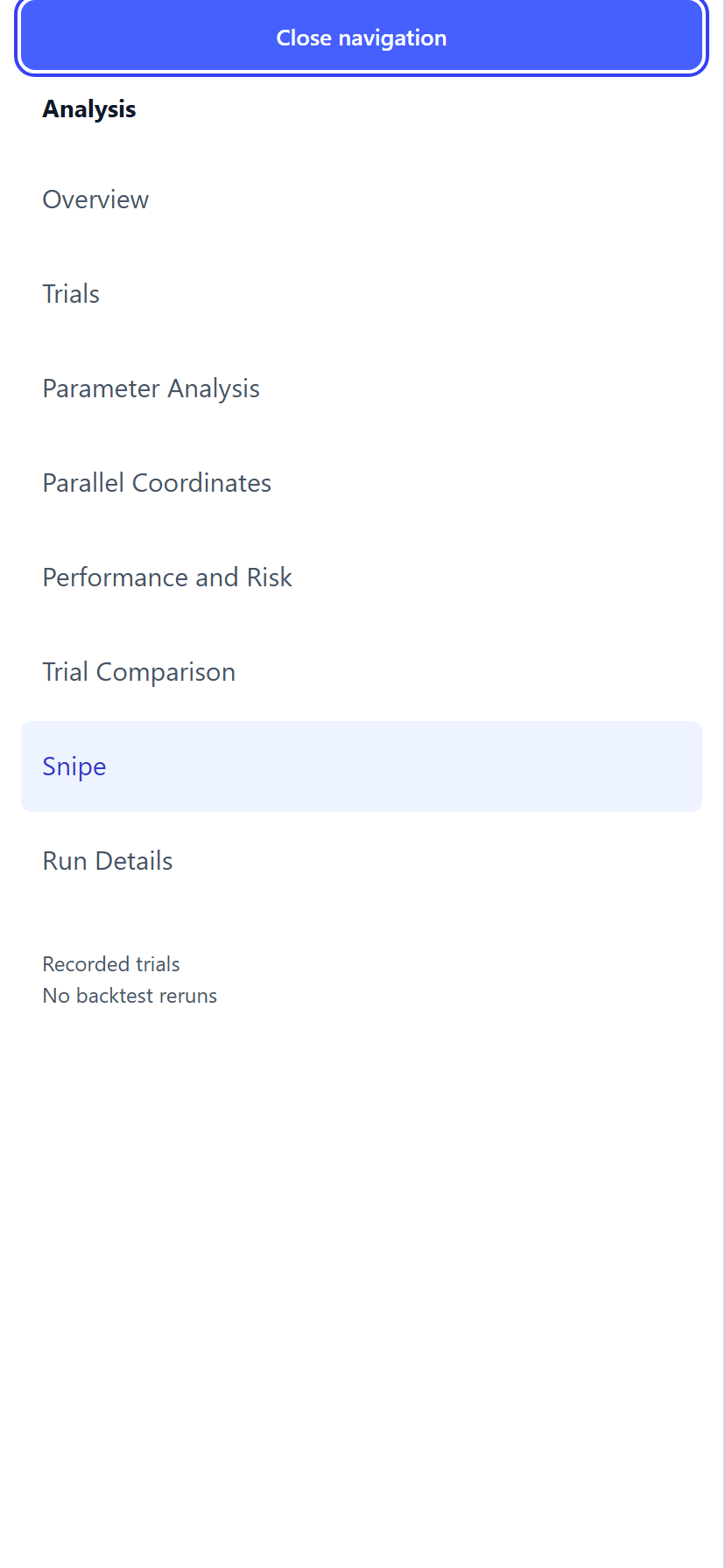
| Analysis sections | 224 px sidebar | Full-screen sheet |
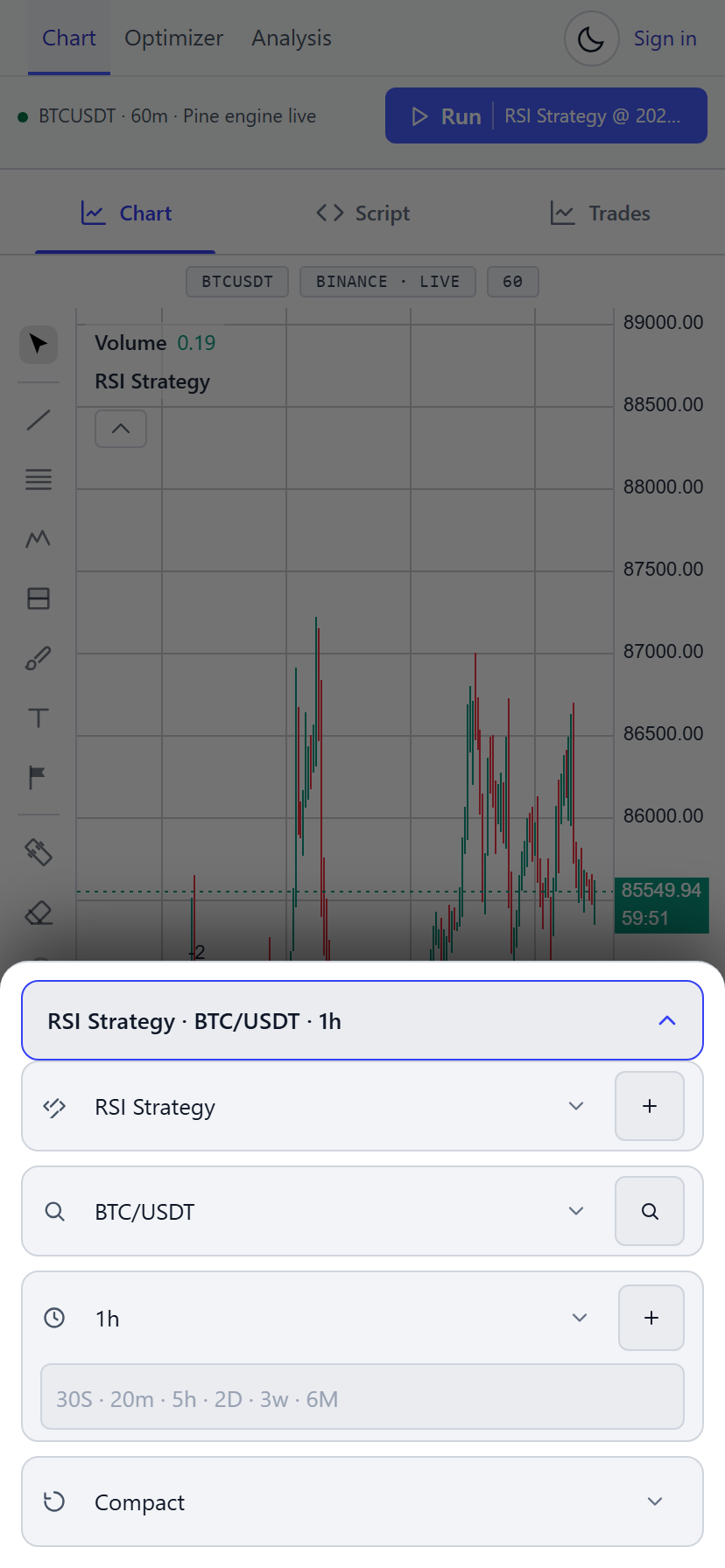
The instrument pill
Eight control boxes collapse into one pill reading something like
RSI Strategy · BTC/USDT · 1h. Opening it turns the four control groups into the body of
the sheet rather than duplicating them — the same elements, repositioned, so selection and
custom timeframes keep working.
Two details the sheet needed to actually work
The scrim is a real element on <body>. A
body::before pseudo-element loses the stacking contest, because the sheet is
positioned inside the topbar, which itself sits in the app grid. A real element wins.
Select positioning is done in JavaScript. The topbar control container is
overflow-x: auto, which clips an in-flow dropdown. Positioned from script the
trigger measured correctly; in flow it landed hundreds of pixels off-screen.
The kebab menus
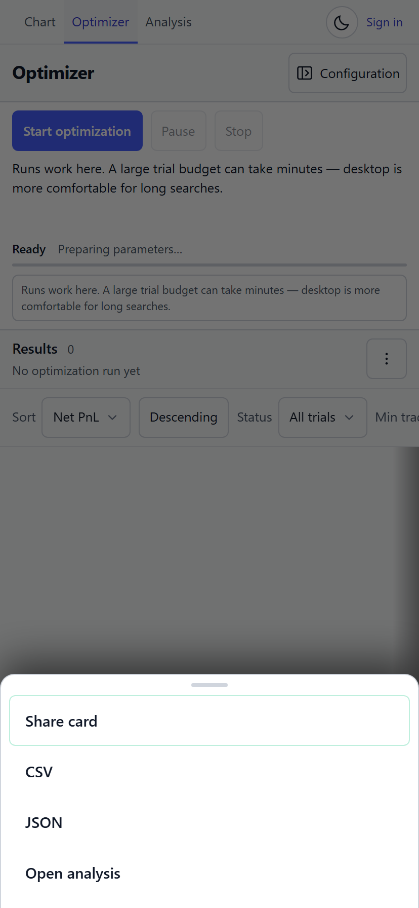
The kebab does not reimplement the buttons — it moves the real ones into the menu. Every id, listener and disabled state survives.
Selects are enhanced, not replaced
Every <select> gains a themed trigger while keeping the native element’s id and options, and
writes back through a real change event. Multiple-selects and oversized selects are skipped
entirely.
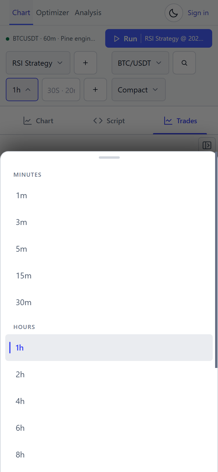
Keyboard support is complete on the custom control: Up/Down/Home/End, Enter or Space to
commit, Escape to dismiss and restore focus, typeahead, plus aria-expanded and
aria-activedescendant. The kebab matches it — Escape closes and refocuses the trigger, and
arrow keys cycle only enabled items.
Pinned columns
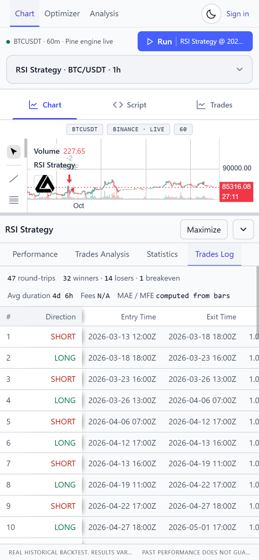
Two tables pin their first columns so a horizontal scroll never loses the row’s identity:
| Table | Pinned |
|---|---|
| Backtest Trades Log | # and Direction |
| Optimizer results | Trial and Status |
| Sidebar trades | First column |
Why a hard-coded pin offset is not good enough
A table cell’s width is only a suggestion — the column grows to fit its content.
Pinning the second column at a hard-coded offset therefore leaves a gap or an overlap
depending on the data.
Measured before the fix: the Trades Log’s first column rendered 34 px while its neighbour was pinned at 48 px, so Direction landed on top of Entry Time and timestamps became unreadable. The results table had the same 11 px gap.
table-pins.js now measures real header widths and writes cumulative
left offsets, re-measuring as the results table streams new trials in.
table-layout: fixed was rejected — it would make the pins exact but force all
columns to share one width.
Degradation is one-directional: if the script fails to load, columns simply are not pinned. Worse, but never wrong.
Touch targets
Two tokens, and a deliberate philosophy — hit area, not painted size. A dense control keeps its small box and grows an invisible inset over it.
| Token | Size | Applies to |
|---|---|---|
--hit | 44 px | Mini topbar controls, theme and sidebar toggles, tab controls, modal close, Vela’s own 22 px toggles |
--hit-dense | 40 px | Optimizer inputs and selects, dialog actions, auth and account controls |
The strategy include checkbox stays a 15 × 15 painted box with a 44 px hit area centred on it. Inflating the visible box would wreck the density of the table row it lives in — the hit area is the correct answer, not the painted one.
Measured before and after
| Before | After | |
|---|---|---|
| Touch targets under 24 px | 15 px checkboxes, 22 px Vela toggles | none |
| Topbar controls off-screen | 3, sitting at right 441–748 px | 0 |
| Backtest KPI headline | y = 881 | y = 407 |
| Chart pane height | 304 px | 564 px |
| Optimizer first result row | 55–59 % down the viewport | 46 % |
| Optimizer filter band | 148 px | 58 px |
| Parallel-coordinates plot | 340 px, crushed | 620 px, pannable |
| Page horizontal overflow | — | none at 360/390/430/768/1512 |
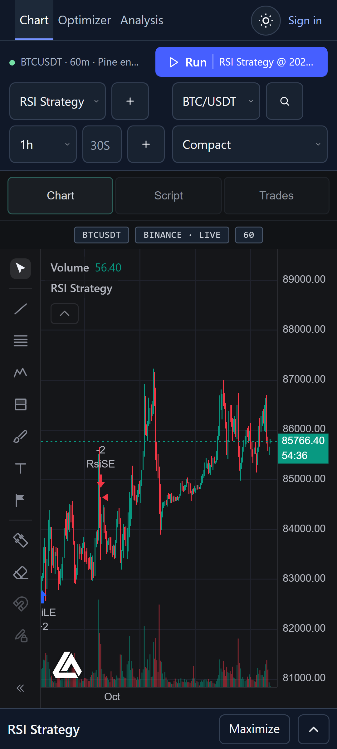
Dialog footers when the keyboard is open
A modal footer is pinned to the end of a flex column while the body scrolls beneath it. The reason is specific: the on-screen keyboard shrinks the visual viewport, so a conventionally positioned footer would be pushed off-screen by the very thing the user opened it for.
Verified at a simulated 390 × 430 with the keyboard up: Cancel and Create both measured 40 px tall and sat inside the viewport.
Long content
Text is fitted rather than allowed to break the layout:
text-size-adjustis pinned to 100 % — it wasauto, which inflated headings past the workspace’s density contract.- The instrument pill ellipsises; pane tab labels are
nowrapwithflex: 1 1 0. - The disclaimer footer collapses to one ellipsised line, with the full text still in the DOM.
What is not verified
Accepted trade-offs
- Tablet at 768 px is deliberately unchanged. It keeps a 444 px chart beside a 320 px sidebar, which is a genuinely better use of the space than the phone layout.
- The parallel-coordinates plot pans rather than fits, with a 620 px floor. Below that, axis labels are unreadable — so it stays expandable instead of being shrunk into uselessness.
- One vendor artefact remains: Vela’s RSI sub-pane legend still clips its last two entries. It is vendor-rendered and reproduces on desktop, so it was left alone.
Next
- Workflow — the judgement loop, on any screen size.
- Limitations — the consolidated list of unverified claims.